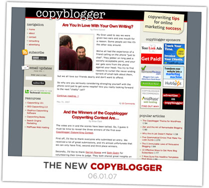
In early May 2007, I redesigned Copyblogger, which was previously the home of my most popular design to date. The old layout was simple, featuring copious amounts of whitespace coupled with understated details. Problem was, Brian started receiving advertising requests, and the old template simply wasn’t able to accommodate the necessary ad positions in addition to keeping the blog’s subscription options at the forefront.

Oh, and based on all the things I’d learned since the last Copyblogger update, I knew there was an opportunity to improve Brian’s in-site SEO, too.
Enter the new design, which I think features a highly-effective organization of key pieces of information. For instance:
- Primary navigation resides in the upper left, which is some of the most premium real estate on the page.
- Subscriptions fuel the site, and the subscription options are placed above the fold on the left along with custom icon embellishments that serve to draw the user’s attention to that area.
- Advertisers receive prominent placement on the right—this wasn’t going to be possible on the old design without sacrificing the subscription options.
Although I don’t think Brian really wanted to change his design, he certainly saw plenty of reasons why he ought to go ahead and do it. With 18,000+ subscribers, he had reached a point where the site had outgrown its current confines, and by making the switch to a newer, smarter layout, he has already expanded the site and positioned it for future growth.