 Tuesday was the opening day for the World Series of Poker, which has grown to become a six week mega-event for all things poker. Of course, there’s the main event that you see on ESPN every year…You know, the one where the winner gets enough money to support Hollywood-level hooker and blow habits. In addition to the main event, there are a bundle of smaller World Series events that cover other poker games like Omaha, Limit, Pot Limit, and more.
To put it another way, the World Series of Poker has everything except a stinkin’ blog.
Until now.
Introducing: The World Series of Poker Blog
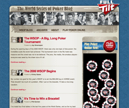
Today, the FullTiltPoker team and I went live with the newly-designed World Series of Poker (WSOP) Blog. The site was created to serve as a one-stop resource for firsthand information from writers and poker pros who are taking part in the WSOP festivities.
For the first time ever, the pros will be providing feedback on the event while it’s happening, and I see this as yet another step in the evolution of poker as it turns into one of America’s favorite obsessions. The all-star blogger lineup over at the WSOP Blog includes (pros in bold):
- Chris “Jesus” Ferguson
- Phil Gordon
- Clonie Gowen
- Kristy Gazes
- Jay Greenspan – semi pro writer
- Storms Reback – co-author of All In: The (Almost) Entirely True Story of the World Series of Poker
A few comments on the design
What you see is actually version two of the design. I had a version one, and late one night, I decided that I hated it :)
So, the next morning, I woke up and created the version that now graces the live site. I’ve never really done a design with “weathered” or “distressed” elements before (save for the comments on this site), so I guess you could call the WSOP Blog a notch on the ole portfolio belt.
Personally, I really like the color scheme employed on the site. It doesn’t have that green felt feel to it, but something about the site still seems to “fit” the poker theme quite nicely, in my opinion. It’s wild west meets casino floor meets the street. I’ve been wanting to do a beige design for a while now, and I finally got a theme where it fit. Sah weet.
![]() Oh, and although the site doesn’t have a lot of crazy features like the BlogHerald, there is one cool thing that’s worth mentioning here. Since the site has multiple authors, we thought it would be cool to include little avatars of the post authors next to the post titles. The end result is pretty slick, and I’m all for new and unexpected ways of displaying the post date!
Oh, and although the site doesn’t have a lot of crazy features like the BlogHerald, there is one cool thing that’s worth mentioning here. Since the site has multiple authors, we thought it would be cool to include little avatars of the post authors next to the post titles. The end result is pretty slick, and I’m all for new and unexpected ways of displaying the post date!