If you’re like me, then you obsess over getting things like images, blockquotes, and lists to display “just right” on your Web site. Through intelligent use of CSS, you can exercise absolute control over your layout, presenting the reader with articles so rich with style that Donatella Versace would be jealous.
Unfortunately, an ever-growing percentage of your readers are never going to see your code-wrangling handiwork, because they prefer to read articles through a feed reader like Google Reader or Bloglines. To make matters worse, you have almost no control over the way your posts will display across the various readers. You can’t use your in-site CSS styles, and – this is the biggest sin of all – images are often displayed inline with text.
The horror.
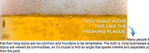
It’s true…ugly feeds can happen to good people. Check out what I mean in the figure below.

Figure 1. An ugly inline image in Google Reader.
You wouldn’t let inline images slip through the cracks like this on your own site, and if you’re anything like me, the feed reader issue drives you nuts. It gets worse, though, because WordPress is not the easiest shrew to tame when it comes to properly formatting posts for display both on your site and in feed readers.
And while WordPress isn’t the only CMS platform out there, the inline image problem extends well beyond the WordPress user base. Therefore, those of you on MovableType, TypePad, Drupal, etc. still ought to be able to glean something positive from this brief tutorial.
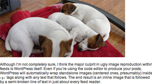
When you’re done, you’ll have better looking feeds that are easier to read, and you’ll have the added benefit of actually being able to sleep at night, which I hear is a bonus. Figure 2, shown below, is an example of a nicely-formatted image within a feed reader—notice how the paragraph text picks up under the picture instead of beside it.

Figure 2. A properly-formatted image in Google Reader.
Feed Reader Formatting Options
As you might expect, feed readers do not offer much flexibility when it comes to styling images. Essentially, you’ve either got a nice image like you see in Figure 2 above, or you end up with the hideous beast that I forced you to look at in Figure 1.
You’re probably accustomed to using image-handling CSS classes (like left, right, and center) on your own site, but at this time, the associated styles will not carry over into feed readers1.
You might also be familiar with the align="left" and align="right" attributes, and while those will work inside feed readers, they are considered deprecated in new XHTML specs from the W3C2. Therefore, if I were to teach you this method, it would be the equivalent of me teaching you the ins and outs of a 5600-baud modem—a complete waste of time, and certainly nothing that is going to help you a couple of years down the road.
So, the bottom line is that the most standards-compliant, most consistent result you can hope for in feed readers is going to resemble Figure 2 (regardless of the image-handling class used), and that’s what you’re going to learn here.
WordPress Post Formatting for Display in Feed Readers
Properly formatting your posts so that images display correctly in feed readers is simple, albeit somewhat counter-intuitive. To illustrate, we’ll start with a very basic example—we’d like a center-aligned image, followed by a paragraph of text (just like you see in Figure 2).
For starters, you’ll need to make sure that you’re editing your post inside the normal text editor and not inside the Rich Visual Text Editor. Although WordPress 2.1+ allows you to switch between the two views, I experienced some problems with this, especially when editing a post after it had already been published. I highly recommend that you disable the Rich Visual Text Editor by going to Users → Edit, and then de-selecting the box next to “Use the visual editor when writing.”
Next, all you have to do is ensure that you treat your image reference like a separate paragraph of text, regardless of whether it’s centered, aligned to the right, or aligned to the left. Done correctly, our example WordPress post entry box would end up looking like this:

Figure 3. A centered image should be treated as an individual paragraph.
Without the single line space between the image reference and the first paragraph of text, you’ll end up with the nearly-pornographic result you saw in Figure 1. Make sure that extra line space is in there before you hit publish, and your post will hit the feed readers in style.
What about left and right-aligned images? To get them to display properly in a feed reader, all you have to do is set up your img reference in a separate paragraph in your post editor, but you also need to make sure that it appears directly before the text that you want it to sit next to. The following example shows exactly how you would structure your post entry box for a right-aligned image:

Figure 4. For consistent results, treat left or right aligned images as separate paragraphs.
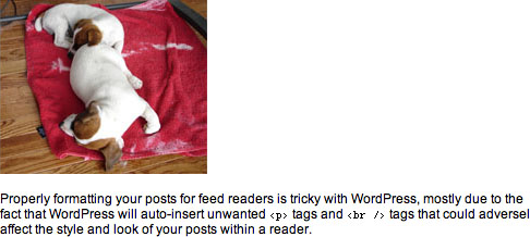
If you’ve done everything correctly, your post will end up looking like this in a feed reader:

Figure 5. A left or right-aligned image doesn’t float beside the text in Google Reader, but at least it doesn’t break the flow of the text.
Although the solutions proposed above are really quite simple in retrospect, they are the only ones I tested where on-site formatting was not compromised. The resulting code is, in my opinion, a little bloated because it contains unnecessary <p> tags, but it still satisfies the following critical requirements:
- No text is broken or displaced in feed readers due to images.
- Visitors to your site will not be able to tell that you’ve done some behind-the-scenes work to ensure that your post displays optimally within a feed reader.
- You don’t have to modify any core WordPress files in order to make this happen—you just have to know how to get the text editor to play nice.
Now go forth, and hook up your RSS subscribers with posts that are a little easier on the eyes!
1 Bloglines is the smartest feed reader that I tested, as it will actually float images left or right depending upon the CSS class used in the img declaration. However, this is the exception, not the rule, so I won’t be addressing this facet of Bloglines directly in this tutorial. Regardless, the techniques described here will work like a charm in Bloglines, so proceed with confidence. ↩
2 Check out the W3C‘s XHTML 1.1 img tag specs. ↩
3 And yes, I know my image captions are “broken” in feed readers, but they look so cool on my site. What can I say, I guess a caption tutorial is next on my list.