Deprecated! This tutorial is only here for historical reference purposes, aka nostalgia.
Adding uniquely-styled Flickr photo streams to your blog is easy, and it’s just another thing you can leverage to make your blog stand out among the crowd. Today, my goal is simply to walk you through the process of creating your very own photo stream so that you can end up with something like this:
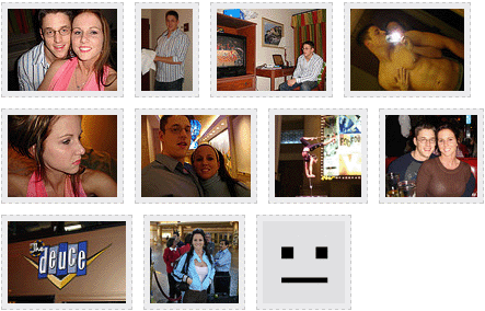
Step one: grabbing your Flickr badge
Alright, I guess now’s a good time to mention that I’ve already assumed a couple of things here:
- First, that you have a Flickr account
- Second, that you have already uploaded some pictures to that account
If you said “yeah…yeah!” to the above items, then you’re ready to rock.
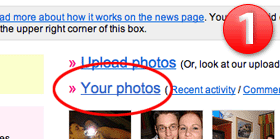
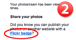 (1) Go ahead and log in to your Flickr account, and then click on the “Your Photos” link to access the – wait for it – “Your Photos” page. Once there, direct your eyes to the rightmost column and (2) look for the “Flickr badge” link underneath the heading, “Share your photos.” Click on that bad boy, and you’ll be directed to a new page where you can go through the stepwise process of setting up your Flickr badge. So far so good, right?
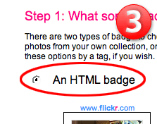 When you reach the badge setup page, (3) the first thing you need to do is select the option to create “an HTML badge” and then click the “next” button below the pictures. On the next screen (which isn’t worth picturing here), go ahead and use the default configuration, which is set to display “all of your public photos,” and then click “next.”
Now you get to choose your photo layout options. Basically, your choices will determine parameters that will be passed along in a snippet of JavaScript that you’ll have to include in the source code for your site (this may sound bad, but it’s dead simple). Fortunately, all of this is automated for you, so (4) choose your display options and move right along. I’ve included my list of recommended options below. Oh, and make sure that last option is “None!”
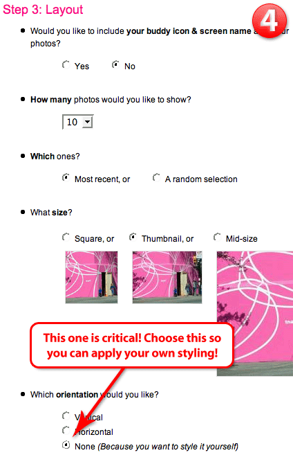
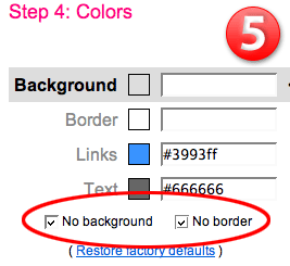 Double-check that last option to make sure you selected “None (Because you want to style it yourself)” and then click “next.” On the ensuing screen, (5) simply select the two options for “no background” and “no border,” and then scroll down and click “next” once more. You don’t want to choose any colors because you’re going to style everything – the borders around the pictures and the way in which they’re presented – yourself. Stick with me here, and you’ll be a Flickr maven in no time.
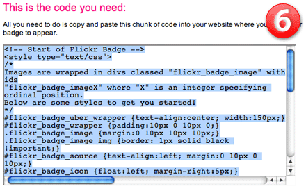
Flickr will now display your unstyled badge in vertical format. Underneath the pictures, you’ll find the source code that you will need to snag for your blog. (6) Simply click anywhere inside the box of code, and then copy the selection, as shown below:
Step two: into your blog
If there’s a part that could be considered the least bit tricky, then this is it. I’m going to do a two-part explanation for both WordPress and MovableType users, and if you’re not using one of these platforms, then you ought to be able to infer what needs to be done because the differences between platforms are almost purely semantic.
The starting condition for all of these examples is that you’ve just copied the code from the Flickr badge creator…
WordPress
Venture into your WordPress Admin and click on the “Presentation” tab. You will then be presented with two “sub tab” options, “Theme,” which is selected, and “Theme Editor.” Choose “Theme Editor,” and then you’ll have to choose the file or files in which you would like to include your Flickr photo stream. In order to help you choose the right file, use this checklist below:
- Do you want the pictures to appear in the sidebar?
- Do you want the pictures to appear somewhere on the main page of your site, either before or after your blog entries?
- Do you want the pictures to appear on a different page altogether?
If #1 is for you, then choose the file sidebar.php. If #2 is more your speed, choose index.php. If #3, you’re kind of on your own there, but I’m going to assume that you probably know enough to choose the appropriate file.
Once your file is loaded into the WP Admin, select where you want the pictures to reside within the code, and paste the copied Flickr code in that location.
MovableType
The default MT installation provides you with template files, and I’ll be using those default names as reference points during this tutorial. For the sake of simplicity, let’s assume you would like to display your photos on the main page of your site.
Log in to your MovableType installation and choose the “Templates” option from the navigational menu. Choose the file called “Main Index,” and it will load up in a box that will allow you to edit the source code for that page. You’ll likely have to scroll down a ways to get beneath the header code, and the first thing you should look for are the MovableType entry display tags that look like this:
<MTEntries>
...some code here to cycle through your posts...
</MTEntries>
Now, if you want your photos to appear before your entries, then simply paste the Flickr badge code before the opening <MTEntries> tag. If you’d like the photos to appear after your posts, then paste the code after the closing </MTEntries> tag. Once you’ve pasted the code in your desired location, you’re ready to begin styling!
Styling up your code
At this point, you should now have a block of code in one of your blog templates that looks like this:
<!-- Start of Flickr Badge -->
<style type="text/css">
/*
Images are wrapped in divs classed "flickr_badge_image" with ids
"flickr_badge_imageX" where "X" is an integer specifying ordinal position.
Below are some styles to get you started!
*/
#flickr_badge_uber_wrapper {text-align:center; width:150px;}
#flickr_badge_wrapper {padding:10px 0 10px 0;}
.flickr_badge_image {margin:0 10px 10px 10px;}
.flickr_badge_image img {border: 1px solid black !important;}
#flickr_badge_source {text-align:left; margin:0 10px 0 10px;}
#flickr_badge_icon {float:left; margin-right:5px;}
#flickr_www {display:block; padding:0 10px 0 10px !important; font: 11px Arial, Helvetica, Sans serif !important; color:#3993ff !important;}
#flickr_badge_uber_wrapper a:hover,
#flickr_badge_uber_wrapper a:link,
#flickr_badge_uber_wrapper a:active,
#flickr_badge_uber_wrapper a:visited {text-decoration:none !important; background:inherit !important;color:#3993ff;}
#flickr_badge_wrapper {}
#flickr_badge_source {padding:0 !important; font: 11px Arial, Helvetica, Sans serif !important; color:#666666 !important;}
</style>
<div id="flickr_badge_uber_wrapper"><a href="http://www.flickr.com" id="flickr_www">www.<strong style="color:#3993ff">flick<span style="color:#ff1c92">r</span></strong>.com</a><div id="flickr_badge_wrapper">
<script type="text/javascript" src="http://www.flickr.com/badge_code_v2.gne?count=10&display=latest&size=t&layout=x&source=user&user=18867172%40N00"></script>
</div></div>
<!-- End of Flickr Badge -->
Right now, it looks like a bit of a mess, but you’ll be happy to know that most of that code is totally unnecessary (at least in my opinion). I want you to edit that Flickr badge code so that it ends up looking like this:
<!-- Start of Flickr Badge -->
<style type="text/css">
.flickr_badge { float: left; }
.flickr_badge img { width: auto; height: 100px; padding: 5px; margin: 0 10px 10px 0; border: 1px solid #000; background: #ccc; float: left; }
</style>
<div class="flickr_badge">
<script type="text/javascript" src="http://www.flickr.com/badge_code_v2.gne?count=10&display=latest&size=t&layout=x&source=user&user=18867172%40N00"></script>
</div>
<!-- End of Flickr Badge -->
Looks a little more friendly, doesn’t it? In the above code, the only thing you really need to be worried about is what falls between the two <style> tags. Let me explain what each item does:
.flickr_badge { float: left; }
All that line does is provide for a container within which your pictures will appear, in effect setting that area apart from the rest of the code in your blog template.
.flickr_badge img { width: auto; height: 100px; padding: 5px; margin: 0 10px 10px 0; border: 1px solid #000; background: #ccc; float: left; }
Specifically, the above style declaration determines how your Flickr photos will appear on your site. In my example, your pictures will each appear 100px high with an adjusted width that maintains the original photo’s aspect ratio. In addition, there will be a 1px black border around the photo that surrounds a 5px gray (#ccc) area that will effectively “frame” each picture. Finally, your pictures will be neatly positioned next to one another with 10px between them, as determined by the margin declaration and also the float: left property.
Note: float: left merely tells the browser to display the photos next to one another horizontally.
Now, if you would like to style your pictures differently, simply tweak the values in that line of code. Don’t want that 5px “frame” effect? Delete padding: 5px. Want a red border with an orange frame? Change border: 1px solid #000 to border: 1px solid #f00 and background: #ccc to background: #f90. Want a dotted border around your pictures? Change border: 1px solid #000 to border: 1px dotted #000. Want your pictures to display vertically instead of horizontally? Just remove the float: left property (but leave it in the surrounding .flickr_badge declaration). Still hungry for more CSS info? Check out the W3C’s guide to CSS styling.
Hopefully you’ve found this tutorial helpful, because that’s all you get from me! Seriously, though, if you use this technique to pimp your blog, I want to know about it! Send me a link so I can check out your awesomeness!